If you’ve ever walked into a room and instantly felt calm, energised, or even overwhelmed without quite knowing why, it could be the colours talking. Colour psychology for home design is more than just a trend; it’s a powerful approach to shaping how your space feels and functions.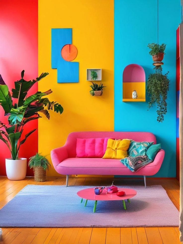
In fact, research shows that up to 90% of snap decisions are influenced by colour alone. That’s a big deal especially when it comes to how your home supports your mental wellbeing and daily mood.
As someone who finds deep peace in soft, earthy tones, I’ve come to appreciate how intentional colour choices can transform a space from chaotic to calming. So today, let’s explore how you can apply colour psychology for your home to create a space that doesn’t just look good, but truly feels good too.
What Is Colour Psychology?
Colour psychology is the study of how different hues impact human behaviour, mood, and perception. It’s not just about what colours you like it’s about how they make you feel.
Think of red- bold, stimulating, energetic. Now think of soft beige- calming, comforting, warm. Both colours communicate different messages to your brain, and that communication influences how you experience a space.
From restaurants using red to stimulate appetite to spas leaning into neutral tones for calm, colour has a quiet power over our everyday lives.
Best Colours to Use in Each Room Based on Mood
Let’s get into how you can intentionally use colour psychology for home design room by room.
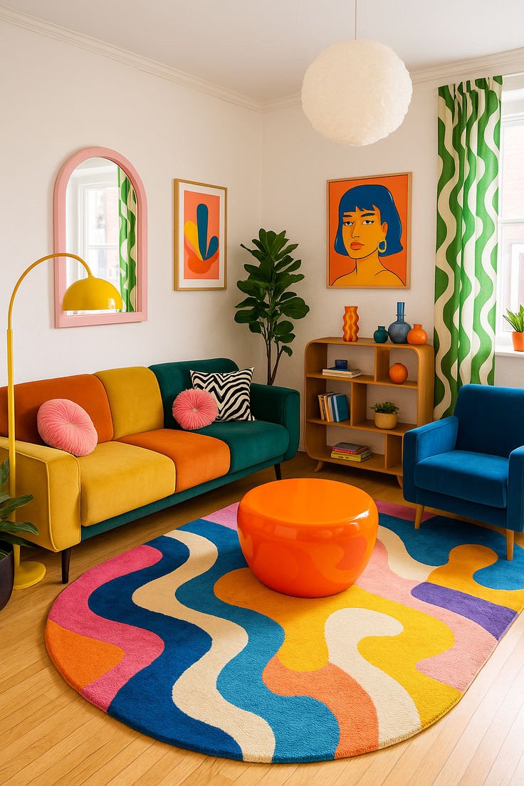
1. Living Room: Energise or Unwind
-
Mood goal: Social, cosy, uplifting
-
Try: Warm tones like soft orange, terracotta, or muted yellow for energy. Prefer calm? Use sage green, cool grey, or sky blue for relaxation.
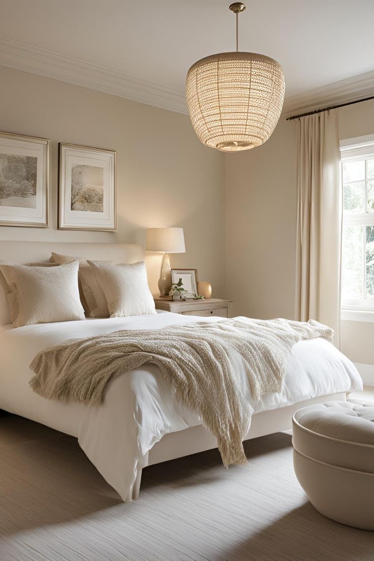
2. Bedroom: Invite Rest and Restoration
-
Mood goal: Peaceful, grounded, private
-
Try: Navy blue for a moody, elegant vibe. For softness, opt for dusty rose, lavender, or creamy beige.
-
Avoid: Bright reds or intense oranges they can overstimulate.
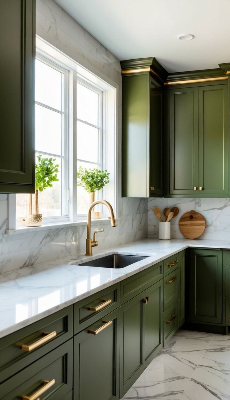
3. Kitchen: Boost Creativity and Warmth
Mood goal: Fresh, nourishing, clean
Try: Olive green, soft peach, or muted blues. These colours feel natural and promote a sense of calm productivity.
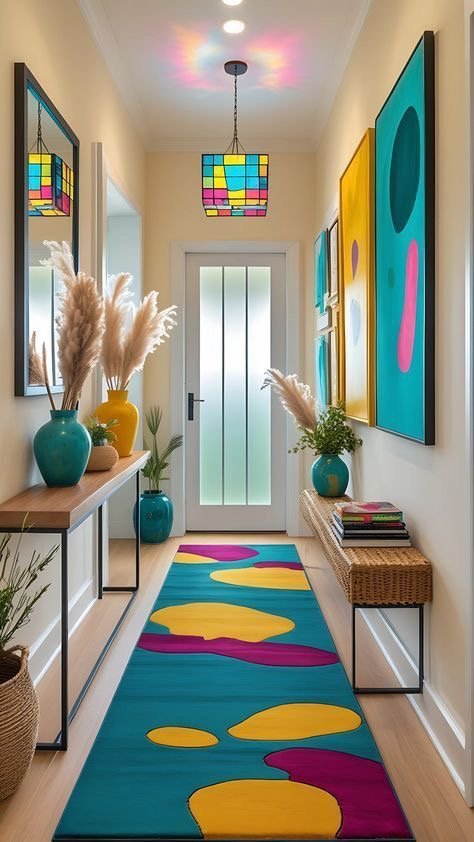
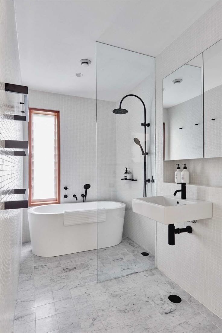
4. Bathroom & Hallways: Keep It Light and Inviting
-
Mood goal: Clean, serene, uncluttered
-
Try: Beige, off-white, or soft browns. These shades reflect light beautifully and create a timeless feel.
Practical Ways to Apply Colour Psychology in Your Home
Choosing the right colour for your home isn’t just about Pinterest aesthetics. Here are a few tips to help:
-
Consider your home’s architecture: Modern homes may suit minimal neutral palettes, while traditional spaces can carry bolder hues.
-
Look at your natural light: Morning light can make a colour appear cooler; afternoon light brings warmth.
-
Blend with your surroundings: Use the colours in your landscape (trees, flowers, earth) as a palette guide.
-
Align with your emotional goals: Want calm? Use cool tones. Want focus? Add blues or greens. Want energy? Introduce warm reds and yellows in moderation.
-
Test swatches first: Paint small sections of a wall to see how the colour plays out throughout the day.
Using Colour Psychology for a Happier Home
Using colour psychology for home design isn’t about following trends it’s about creating a space that aligns with how you want to feel. Whether you’re seeking stillness, energy, or comfort, colour is one of the simplest ways to design a space that truly supports you.
So go ahead light a candle, splash a fresh coat of paint, and design a home that feels like a deep breath at the end of the day.
If you found this helpful, you might also enjoy my post on How to create a Pinterest-worthy living room.